
|
|
|
Tidyman, old and new version, ©Keep Britain Tidy
|
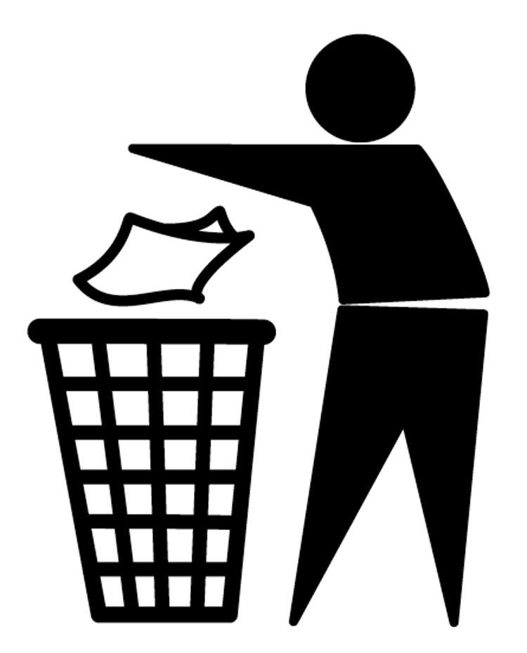

Tidyman was born in the 50s and, as far as we know, in the United States, popularized by a beer producer, with the educational intent to promote both empty bottle collection and virtuous behaviour models. Tidyman soon became a real character with an international vocation: he is affable and talks to everybody, young and old alike, with no need of supporting texts. A symbol of any kind of waste, in the 70s it became the Keep Britain Tidy’s (a Charity Organization) icon and it was used in its social campaigns. The author, as it happens, is unknown: a certain Sarah Williams, in a post traced online, ascribes the drawing to her father Raymond, appointed by Robert Worley, Keep Britain Tidy Group’s chairman.
But had it not already been there in the United States in the 50s? Perhaps the point – for once – is not in tracking down the author. Because very soon and long before the design of logos and symbols promoting responsible behaviour, Tidyman is de facto everybody’s symbol and its appropriation is collective, with no real author. This stylised little man with a ball-shaped head, a pictogram, stoops while gently dropping rubbish into an old-fashioned waste container, it becomes a playmate in public areas, you find him in every street corner and wherever it can be shown. It is a sign of modernity and civic-mindedness. And its popularity increases as it is printed on food products’ packages, which not all of us would remember. Tidyman is a public domain symbol and has had a long life almost up until today, amongst uses and misuses, such as the numerous and free re-elaborated versions and parodies.
Its vagueness, though, in the separate waste collection era, made it a little obsolete. So, in 2010, Keep Britain tidy decided to abandon it. Brand Catalyst, the association’s senior designer, suggests a variation as a replacement, less invasive but jollier, while Brand Catalyst coordinated its new identity. The little man became green, he stands next to a rubbish bin but in an upright posture, then he changes position, he becomes alive, he “specializes” and a big heart beats in his chest. The new symbol is part of the current public awareness campaign Love Where you Live. Actually, Keep Britain Tidy is not scrapping the old symbol but it is rather revising its mission and adjusting its actions, because according to the data collected it is still necessary to raise awareness while social behaviour requires new ways of communication and vice versa. So, it is all about the transformation of a new mode of communication, not just an icon.
Keep Britain Tidy’s website, which we suggest you visit and navigate, is a big world of initiatives and organizational qualities, so far unequalled. The little man appears here and there on the website in its brand new form, but it is merely a trace in the context. While the old symbol, the black one, although landfilled, will always be found on the web and around the world, especially that “mixed waste” world that desperately needs it. And because it belongs to everyone, nobody will ever be able to erase the old Tidyman.
 |
|
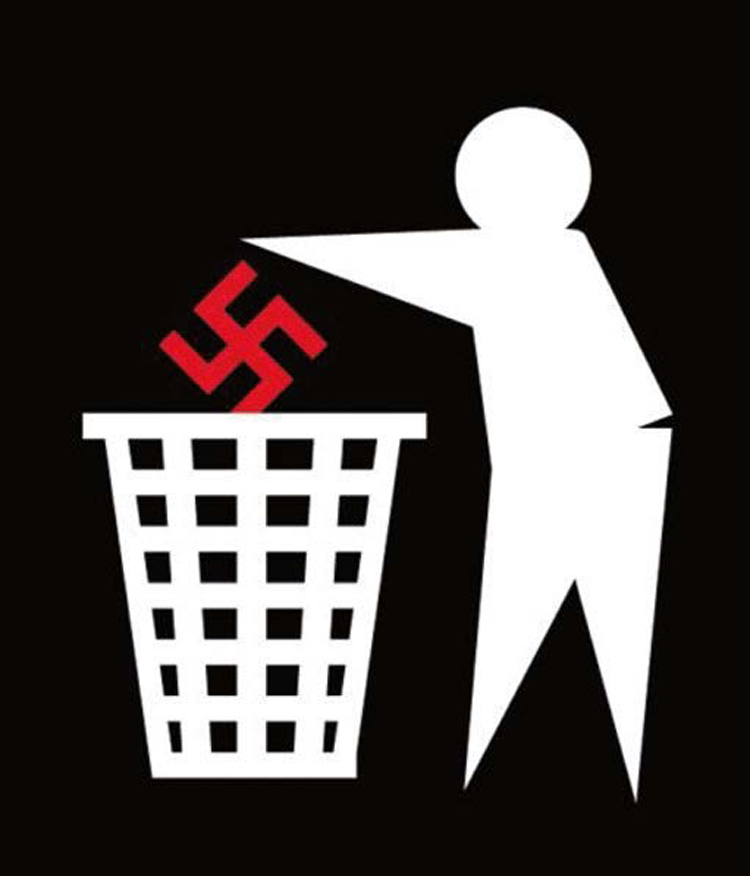
Anti-Nazi Tidyman
|
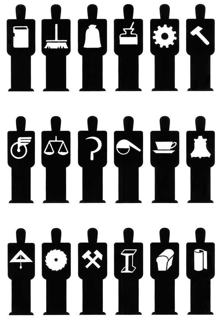
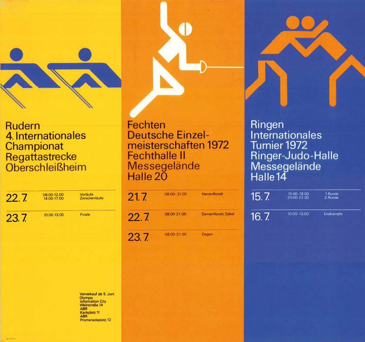
But where did this idea to draw such abstract little men/symbols, useful to a simple and direct kind of communication originate? It dates back to a long time ago, to be precise to the Wissenschaftliche Weltauffassung (The scientific conception of the world: the Vienna Circle). We are in Vienna in the 20s, a melting pot of modernity and political project of social emancipation. The idea to invent pictograms belongs to Otto Neurath – a scientist, philosopher and sociologist with a socialist worldview – who, in 1936, wrote: “Words divide, images create contacts.” Neurath invented a very ambitious language made of images: the idea is clear, legible and international. He calls it ISOTYPE, an acronym for International System of Typographic Picture Education. The project, later developed with his wife Marie and graphic designer Gerd Arnts who designed thousands of symbols, has a mission: to offer, in a simple and effective way, those with little or no education an easy read and visualization of socially and historically important themes. Indeed, a supporting visual language, a utopia. This idea would then find its way into the heart of post-war modernist panorama and the whole world would embrace it, stripped of its more social and innovative connotations in favour of the International Style. Just think of the road signs (the US Department of Transportation is a good case in point), of the signs for public and work places, sports’ symbols (Otl Aicher’s ones for the 1972 Munich Olympic Games were amongst the most charming ones), up to today’s infographic data.
 |
|
Gerd Arntz, men and professions according to Isotype
|
It is an ongoing process, if we consider how many designers are still devoting their time to its development and optimization. Neurath wrote: “An image that makes good use of a system must convey all relevant information about the represented element. At first glance, one notices the most important elements, at the second, the less important and at the third, the details. At the forth, nothing should be noticed anymore.”
 |
|
Otl Aicher, 1972 Munich Olympic Games’ daily programme
|
Right, let’s have a little test, to see whether this “universalist” project actually works: let’s consider a symbol that everybody knows, the toilet pictogram. This couple divided by a vertical line, what on earth could it mean? “Toilette”, of course, you may say, for men and women. That’s true, we are used to reading it like so (and often we are desperate to locate such sign at an airport), but if we absurdly imagine someone who might never have seen such sign (a Martian), why should he think of a toilet and not of a divorce or God knows what? Try and play with your imagination: what if there were two men and a woman or two men only?
 |
|
Visual perception: It can’t be a toilet. What is it?
|
So the story of our little man comes to an end. Symbols are not always adequate and easily interpreted: a lot depends on their widespread and conventional use, on context and on the designer’s ability. This applies to all images, that are not a universal language, whatever the good old Neurath might have thought. And while infographics become so pervasive in every visual field, in this magazine where we care about clarity and quality of writing and graphics we often wonder if, beyond the trend of the moment, all this designing new little men and data is at all always effective. Perhaps Tidyman, a forerunner of a dominant visual culture, will offer us cause for reflection.
Keep Britain Tidy, www.keepbritaintidy.org
The new Tidy: www.peterberrecloth.com/?project=04-tidyman