


It is a “common” symbol, a recognized iconic object that is part of our pre-ecological imagery. By the way, for graphic designers such symbol is defined as “trademark” and not a “logo” because it has no text, even though “logo”, in the Anglo-Saxon culture means “trademark”, but enough with it.
Such recycling logo is now turning 45: it was born in the USA in 1970, which was also the year in which the first Earth Day was celebrated. In that year, CCA (Container Corporation of America, today Smurfit-Stone Container Corporation), a large company producing packaging with recycled paper, decided to divulge in various universities a call for entries for a graphic design competition aimed at designing a symbol for products on recycled paper encompassing an environmental message, to be used by all those who needed it (public domain). The mind behind such designing ideas and CCA’s communication was Walter Paepcke, CCA Chairman and above all a philanthropist who, in 1937, had already sponsored the resurgence of Bauhaus in the USA (The New Bauhaus, which later became the Illinois Institute of Technology) and summoned the German graphic designer Herbert Bayer to organize the Design Conference in Aspen in 1951. Paepcke and Bayer are then key names to grasp the origin of the symbol in question. But one name is still missing.
500 young designers took part in the competition. At the Aspen conference of the same year, with Bayer and Saul Bass as members of the jury, the winner was announced: it was Gary Anderson (Hawaii, 1947), a young town planner architect from the University of Southern California. This university – and this applies to all training of those years – took part in Modernism, in programmes and the aesthetics of the reformed Bauhaus. The winning logo, according to the critics of the time, was in line with the great masters’ criteria: geometric and functional. Actually, Gary Anderson had that kind of background, but he also followed countercultural movements of the time and new aesthetics, drawing inspiration for this logo from the Möbius strip and M. C. Escher in San Francisco. The aesthetic aspect of such logo is better understood within such double cultural reading, poised between Modernism and new visual cultures: a symbol crossing two worlds.
 |
|
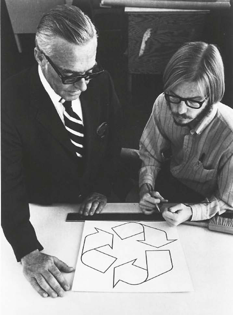
Gary Anderson (right)
|
As this logo became widely used, Anderson left the USA and, after a failed attempt to get the symbol registered, its creation is generically attributed to CCA’s graphic department and the logo became public domain, as initially intended by the competition. It was not until the 90s that the truth was fully disclosed, thanks to an article published in Print, the well-known American magazine. The now seventy-year-old, multi-award winning, globetrotting accomplished town planner Gary Andersen, with an important professional and academic curriculum, is “morally” reunited with his creature and so are we. While contemporary iconic culture has appropriated the symbol transforming it beyond recognition, the original one, for specific and non-illustrative purposes, is still very much alive and kicking.
 |
|
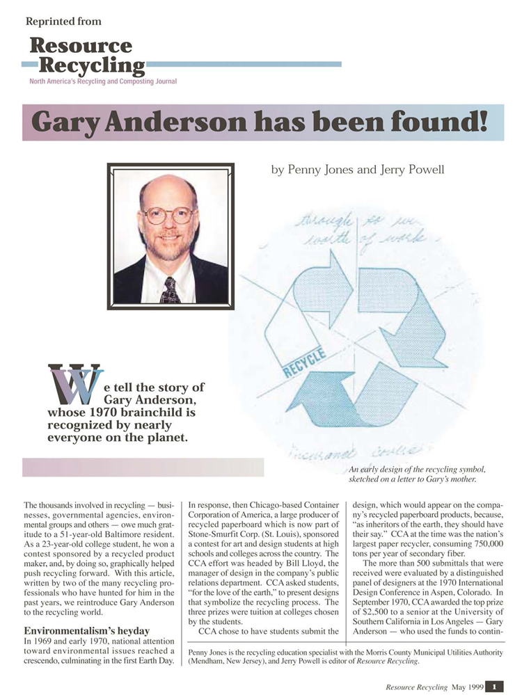
Reunited with Its Author, from Resource Recycling, 1999
|
 |
|
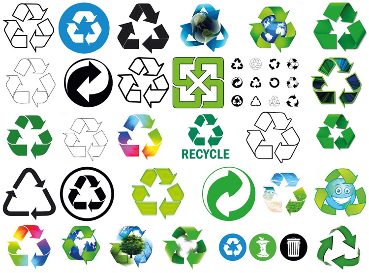
A Google Page, Today: Original Symbol’s Illustrational Changes
|